Air Dolomiti Trades Turquoise for Lufthansa Core Blue
Air Dolomiti’s signature turquoise is officially on its way out. The regional carrier is swapping its bright, distinct look for the sleek Lufthansa Group Core Blue palette right across the fleet.
Key Details
- Airline
- Air Dolomiti
- Parent Group
- Lufthansa Group
- New Color Scheme
- Core Blue
- Aircraft Type
- Embraer E195
A Fresh Coat for an Italian Standard

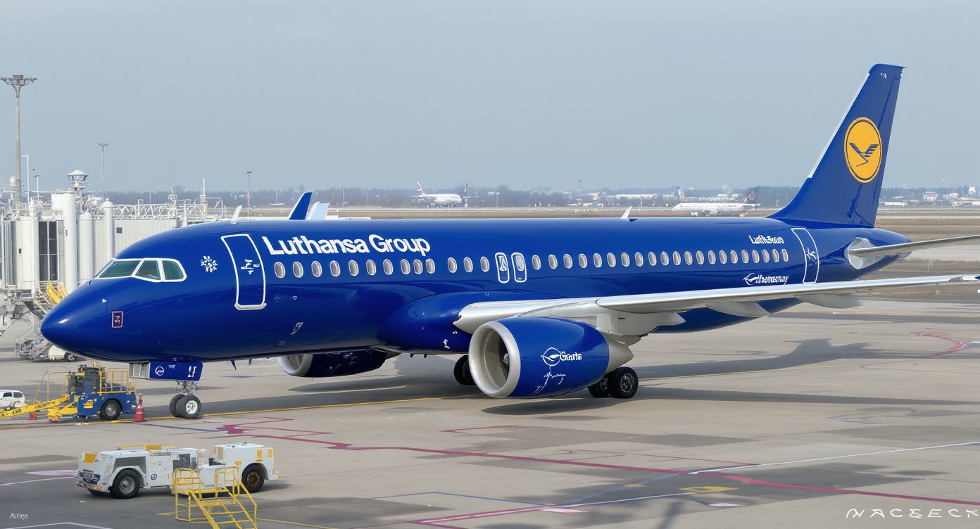
Air Dolomiti's giving its fleet a serious visual tune-up. The regional carrier, well known across Italian and European skies as a key operational arm of the Lufthansa Group, is ditching its familiar turquoise accents in favor of a much sharper, unified look. The airline is rolling out the Lufthansa Group Core Blue palette across its branding and aircraft exteriors, signaling a deeper alignment with its parent company's overarching visual identity.
For years, that splash of turquoise on Air Dolomiti's tails and engines gave the carrier a distinct, independent personality on the ramp. But aviation's a game of corporate synergy, and uniformity usually wins the day. By bringing its visual identity into direct alignment with the core brand standards of the wider Lufthansa family, the airline is streamlining how it presents itself to passengers from Frankfurt to Florence.
The Embraer Fleet Gets the Core Blue Treatment

The transformation kicks off with the upcoming arrival of the airline's first Embraer E195 sporting the newly minted color scheme. Technicians and painters are currently working to translate the Core Blue aesthetic onto the sleek lines of the regional jet, setting a new standard for every aircraft that rolls through the hangar next. It's not merely a quick paint job; it's a comprehensive overhaul of the visual touchpoints that define the company's onboard product and ground presence.
Travelers might miss the quirky personality of the old turquoise scheme, but the new livery brings a modern, understated elegance to the fleet. The deep navy tones project stability and corporate muscle, traits that matter immensely in the competitive European regional market. It's a visual cue that tells passengers they're stepping onto an aircraft backed by one of the largest aviation conglomerates on the globe, even if the flight is operated by a nimble Italian regional specialist.
Aligning the Brand for the Long Haul
This aesthetic shift is just one piece of a broader evolutionary puzzle for the carrier. Airlines don't rebrand on a whim; these cosmetic updates usually accompany deeper operational realignments, digital overhauls, and service tweaks designed to make the passenger journey seamless across multiple partner airlines. Whether you're connecting through major hubs or flying point-to-point, the messaging needs to look and feel cohesive.
The transition also highlights how regional carriers within massive groups must continually balance local identity with global standardization. While Air Dolomiti retains its distinct Italian flair and operational independence, the visual nod to Frankfurt leaves zero doubt about who's steering the ship. As the rest of the fleet cycles through heavy checks and repaint schedules over the coming months, the turquoise era will quietly fade into memory, making way for a unified blue horizon.
Source: ItaliaVola | 8 September 2026 | Originally in IT
Why It Matters
This rebrand strengthens visual and corporate ties between Air Dolomiti and the wider Lufthansa Group, modernizing the regional carrier's fleet identity for international travelers.
Source: ItaliaVola. Content curated and produced by Skyplus Team.
Related
More Stories